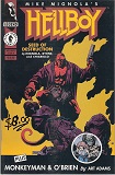
Hellboy, Vol. 1: Seed of Destruction, by Mike Mignola
Book Review by Joshua Palmatier
Have you read this book?
I'm reading some graphic novels with a friend of mine who's an artist. So I give him my take on the writing and he gives me his take on the art. The Hellboy series is our current project.
The premise: Hellboy is called forth by a dark mage working with the Nazis who wants to wake the Serpent, seven stones floating in space that serve as a prison for something dark and hideous. But Hellboy appears in a different location and becomes part of a paranormal investigation group. Fifty years later, the mage has returned, ready to use Hellboy as a conduit to bring the Serpent to Earth.
This is the beginning of the Hellboy saga and so my main reaction to this first volume is that the plot is simple and short. So it isn't as fulfilling in terms of plot as I'd like. BUT I think the real point here is to introduce us to Hellboy himself, and he certainly catches your attention. After reading this, I want to know more about him and the situations he's been in and will get into in the future. So this serves its purpose well. He's certainly an interesting character, not what you'd expect seeing just a drawing of him.
I had a couple of issues with this first volume. The graphic novel has a certain feel, based on the basis in the past (1940s), and the atmosphere of the mansion where most of this is set, so the sudden appearance of the stones floating in space with the spacemen for a single page was kind of jolting, since it didn't fit that atmosphere well. I assume in future editions we'll return to these people, but to have them for only one page in this story felt odd. And then the plot itself wasn't all that deep. Perhaps that should be expected when testing out a new concept/character like this though. I also felt that too much time was spent on Hellboy fighting the frog monsters. Personally, I thought some of this time could have been spent on deepening the plot.
But as my artist friend points out, the fight scenes are where the artist really gets to be creative, so perhaps I'm missing some of the awesomeness here. In terms of the art, I felt the style was very vertical in nature (lots of verticality in the people, the panels, etc). The dark borders of this edition worked well for the atmosphere and really helped with the shading and darkness of this piece. The colors used were also fitting for such a main character. I personally felt that there were some missed opportunities with the colorations though--where the artist could have made significant panels or parts of panels really pop by giving those parts a bright color that would contrast with the darker backgrounds and overall colorations. They do this with Hellboy's red skin readily enough (perhaps too much?), so why not with some of the more significant moments, like the discovery of Emma's body? or Liz's flame? (The artist does have a stunning blast in the final battle with the mage. In fact, that entire chapter was well done in terms of color, shifting from blues to greens to fiery yellows and oranges, then back to blues at the end.)
In any case, this was a good introduction to Hellboy and really piques your interest in his character. But it does feel like just an introduction, that there's much more that needs to be explored here, and could have been somewhat deeper in terms of plot.
Joshua Palmatier/Benjamin Tate
www.joshuapalmatier.com
www.benjamintate.com
|
Click here to buy Hellboy, Vol. 1: Seed of Destruction, by Mike Mignola on Amazon
|
Hellboy, Vol. 1: Seed of Destruction, by Mike Mignola on Amazon

| More Books You Might Like |
Comment on Hellboy, Vol. 1: Seed of Destruction, by Mike Mignola
| Comments on Hellboy, Vol. 1: Seed of Destruction, by Mike Mignola |
| There are no comments on this book. |
